Composition Dissection
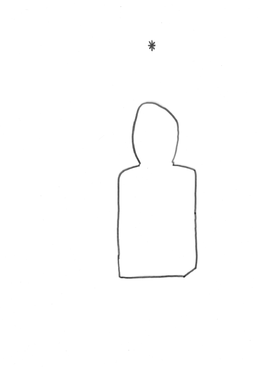
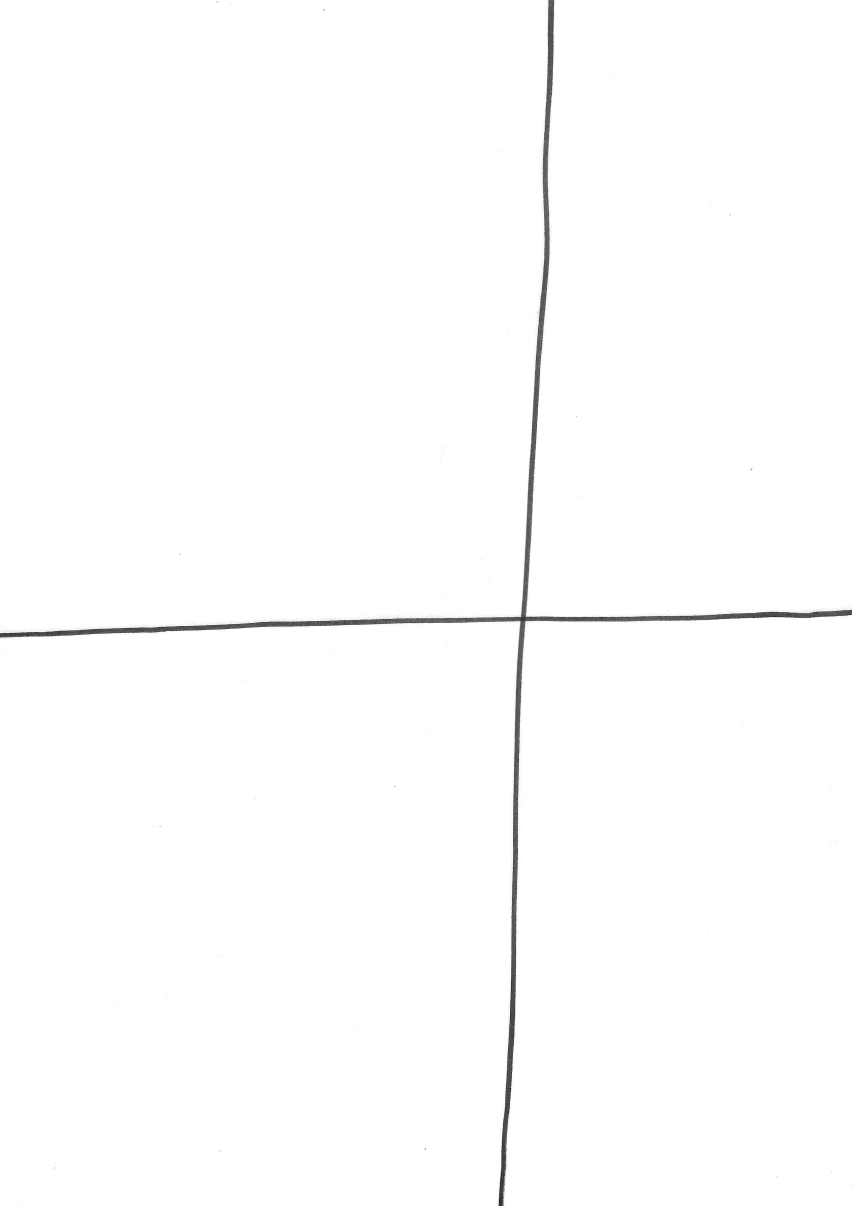
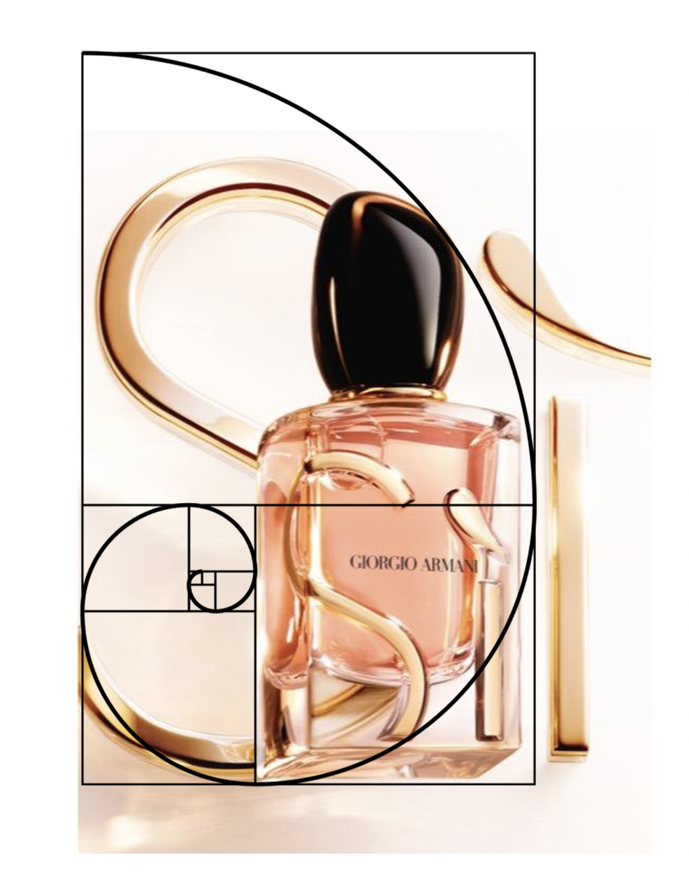
This week's class Design task focused on understanding and breaking down the elements and factors used to create dynamic compositions. Using A4 magazine luxury advertisements, the task involved isolating the focal point, foreground, background, and lines of balance and compiling those elements on separate layers of tracing paper. My advertisement for the task was a Giorgio Armani ad for the new refillable bottle of their perfume SÌ, which retails for £103 for 50ml and is marketed to women. The page includes a focus on the Armani logo, which is in the font “Italian Didot”. The font is designed to look traditional and refined, with an increased stroke contrast between thick and thin points, including hairline strokes for horizontal lines and rising vertical lines (vertical stress). The font also includes flat, unbracketed serifs.
The ad adheres to the 8 elements of composition - Unity, Balance, Movement, Rhythm, Focus, Contrast, Pattern, and Proportion. And uses the elements of art and design cleanly - Line, Shape, Colour, Value, Texture, Form, and Space.
Personally, my eyes start at the top of the page at the Armani brand logo, they then pan down to the product photograph and lastly finish at the simple description. The hierarchy of the text is simple, the largest most prominent being at the top in all caps, that text is repeated in the logo on the bottle in a smaller font then the footer is written in a similar style without any capital letters. Excluding the magazine's red margin, the ad is centre-aligned and the writing adheres to that. The colours are all warm tones, and the proportions of the page are balanced. With sufficient negative space to add contrast to the subject matter.
Below is my work from the exercise. From the top left across there is the focal point in astrix along with the outline of the element in the foreground. The box that outlines the logo. The lines of balance for the vertical and horizontal planes. The background space shaded, and outlines of all the elements, with a box for text too small to outline. Lastly a colour scan of the ad. Below all that is an overlay of the main page component under a golden ratio template, showing loose adherence to those proportional outlines.


Comments
Post a Comment