Christopher Bradley Hole - Telegraph Garden - RHS Chelsea 2013
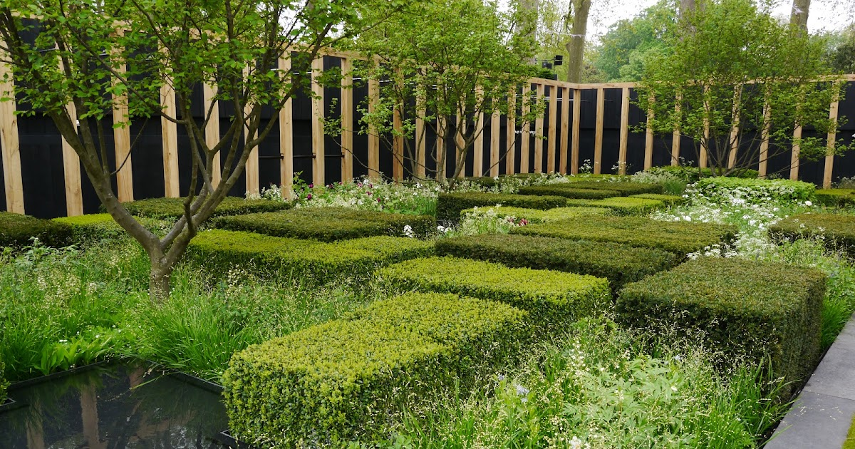
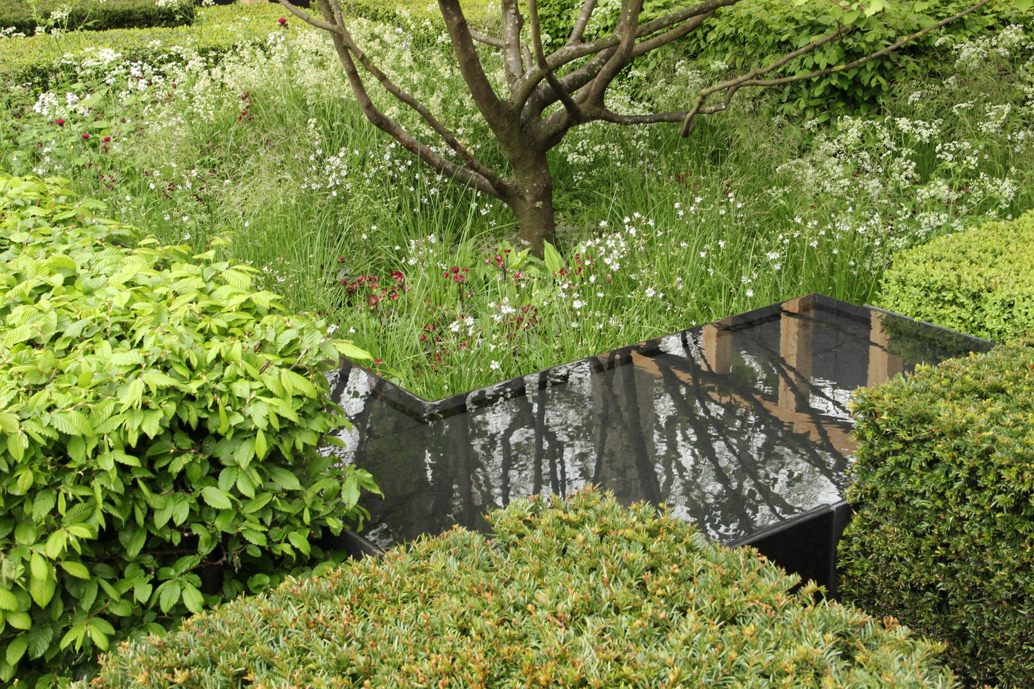
Using a Japanese-esque approach to garden design applied in context to the English Landscape. Bradley Holes's concept was a visualisation of the typical British countryside from a plan view. Showing the patchwork field patterns, with darker patches of woodland, and intertwining partially hidden rivers. Using hazel to represent the woodland canopy layers, box, yew and beech in place of the scrubland margins and mix of grasses and perennials as field crops and meadow.
It was a contemporary composition inspired by the 3 themes: the English landscape, the Japanese approach to garden making and modern abstract art. The underlying structure of the garden is geometric, with a structural colonnade made of English oak along two perimeter sides, and rectilinear blocks of shrub planting. However, the overall effect is softened through the nature of softscaping. The 3 hazels, although not true multi-stems, create a softening veil breaking up the view of the colonnade. The design used English native trees and shrubs to create an understory expressing the way the manmade rigid and controlled field patterns have been superimposed on the natural landscape. The 2 tree species, both iconic British Natives, hazel (Corylus - a symbol of the working forest) and English Oak (Quercus robur) add to the heritage identity of the garden.


It was a contemporary composition inspired by the 3 themes: the English landscape, the Japanese approach to garden making and modern abstract art. The underlying structure of the garden is geometric, with a structural colonnade made of English oak along two perimeter sides, and rectilinear blocks of shrub planting. However, the overall effect is softened through the nature of softscaping. The 3 hazels, although not true multi-stems, create a softening veil breaking up the view of the colonnade. The design used English native trees and shrubs to create an understory expressing the way the manmade rigid and controlled field patterns have been superimposed on the natural landscape. The 2 tree species, both iconic British Natives, hazel (Corylus - a symbol of the working forest) and English Oak (Quercus robur) add to the heritage identity of the garden.
The exhibit won a Chelsea gold medal in 2013.
Like with most modernist designs, I am only a fan of the piece after learning about the meaning and message behind the designer's choices and inspiration. My initial opinion of the piece was that it felt commercially orientated, with the oak pillar surrounding it looking like an office block and reminded me of the glass house courtyard in the New York Times Tower. It is definitely a show garden, as the maintenance of the topiary hedges with all the dense interplanting would be extremely tedious and complicated.
However, for its purpose, I am fond of the concept the design embodies and find the textural differences between the rigidity of the rectangular hedges and the free-flowing grasses visually engaging. Personally, I would have liked more colour as the overall design gets washed out in photographs and the hedges, though different species all look like blocks of similar green. Corylus maxima Purpurea, purple hazel, comes to mind as it fits with the overall hedgerow theme, or Fagus 'Atropurpurea', purple beech. Even held back Prunus spinosa, which usually flowers a month or so in advance of Chelsea.
I would have also preferred the water feature to be more curvilinear and organic in shape, rivers don't carve 90-degree angles into the landscape as represented in the design, showing the impact nature can still have, even on on our own manmade changes. A snaking curve, cutting through the constrained geometric, gridlike heading would personally be more dynamic and representational of the British landscape. England has many notable rivers, like the Severn, Thames, Trent, Wye, etc, and the impact they have on the landscape overview is not something we have much impact on. The overlying changes we make are superficial and easily reversible in comparison. I think that that juxtaposition of manmade and enduring natural processes would have added another dimension to the concept, and made it more recognizable as a landscape plan and not just artistic geometry.


Comments
Post a Comment